
The initiative was launched by Ed Hawkins, a University of Reading professor, with the mission to “communicate climate change in a simple, stark and compelling way as possible”.
What are these graphics?
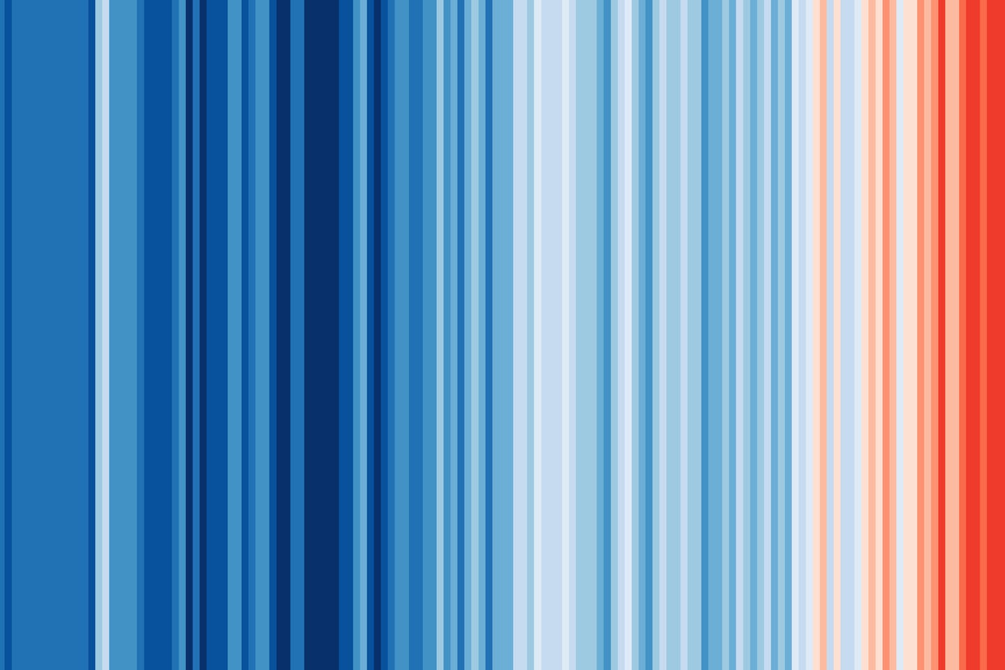
These ‘warming stripe’ graphics are visual representations of the change in temperature as measured in each country over the past 100+ years. Each stripe represents the temperature in that country averaged over a year. For most countries, the stripes start in the year 1901 and finish in 2020. For the ocean basins and for several countries with longer datasets available the stripes start in the 19th century instead. For two cities (Stockholm and Vienna), the data starts in the 18th century.
What do the graphics show?
For virtually every country or region, the stripes turn from mainly blue to mainly red in more recent years, illustrating the rise in average temperatures in that country.
Why are there no numbers on the graphics?
These graphics are specifically designed to be as simple as possible, and to start conversations about our warming world and the risks of climate change. There are numerous sources of information which provide more specific details about how temperatures have changed, so these graphics fill a gap and enable communication with minimal scientific knowledge required to understand their meaning.
What can I do with these graphics?
The graphics have a CC-BY 4.0 license, so can be used for any purpose as long as credit is given to Professor Ed Hawkins (University of Reading) and a link is provided to this website.
How have these graphics been made?
For most countries, the data comes from the Berkeley Earth temperature dataset, updated to the end of 2020. For some countries (USA, UK, Switzerland, Germany, France & Sweden) the data comes from the relevant national meteorological agency. For each country, the average temperature in 1971-2000 is set as the boundary between blue and red colours, and the colour scale varies from +/- 2.6 standard deviations of the annual average temperatures between 1901-2000. For the global average only, the UK Met Office HadCRUT5.0 dataset is used and the colour scale goes from -0.75°C to +0.75°C. The stripes are usually shown for the period 1901-2020 but this can be longer or slightly shorter depending on the location and whether the data is available & considered robust.
What country boundaries are you using?
We are using present day country boundaries for the whole time period shown.
Social Tag
Images


This is the temperature change globally from 1850, in Sweden from 1860 and in the Arctic Ocean from 1893.
— Greta Thunberg (@GretaThunberg) June 21, 2021
It seems we're almost running out of colours…
Find the stripes for your region at https://t.co/ElkcJMJcPu , an initiative by the University of Reading.#ShowYourStripes pic.twitter.com/s4VtTLBbhY
How has temperature changed where you're from? In Canada, average temperatures are warming twice as fast as the global average. Rising seas, thawing permafrost, unprecedented heatwaves and wildfires: the impacts of climate change are here and now. #ShowYourStripes pic.twitter.com/CAitbVqkTU
— Prof. Katharine Hayhoe (@KHayhoe) June 21, 2021
You might see TV meteorologists using #ShowYourStripes to start climate change conversations over the next few days, like this example on @abcnews.
— Ed Hawkins (@ed_hawkins) June 20, 2021
Graphics: https://t.co/NCt3GNpeSN pic.twitter.com/TKHOYkNnD6
You must be logged in to post a comment.